


Have a look at the above four images… These are the home screens of the various mobile devices, major screen shots from Windows Mobile, Windows Mobile is very flexible and allows you to customize its UI the way you want. Anyways coming back to topic.
Looking at above four images, which user interface really appeals you? Now, if I am going to use new UIs for first time, it definitely appeals me.. for example iPhone UI is great, I love it.. it appeals me.. similarly HTC Diamond or HTC Touch Pro UI is very nice and appealing. I used all the above phone for several months. User interface is great, nice to play around with.. but then it starts getting boring more you use it.. more boring it seems.
I like to keep information at my fingertip. Basically you can say I am information greedy and I always want to have information when I need it.
Now, lets look at the screen shots of Mobile UI one by one from top left to right bottom. If you look at the first screenshot top left, first screenshot is very much normal, not appealing at all.. just shows time, owner of cell phone, how many msgs in inbox or emails in inbox, shows appointments and task list in home screen.
2nd Screen shot shows, time, weather, shortcuts to few programs and appointments.. but if I want to go from time to weather or shortcut.. I have to click or touch on relevant tab button.
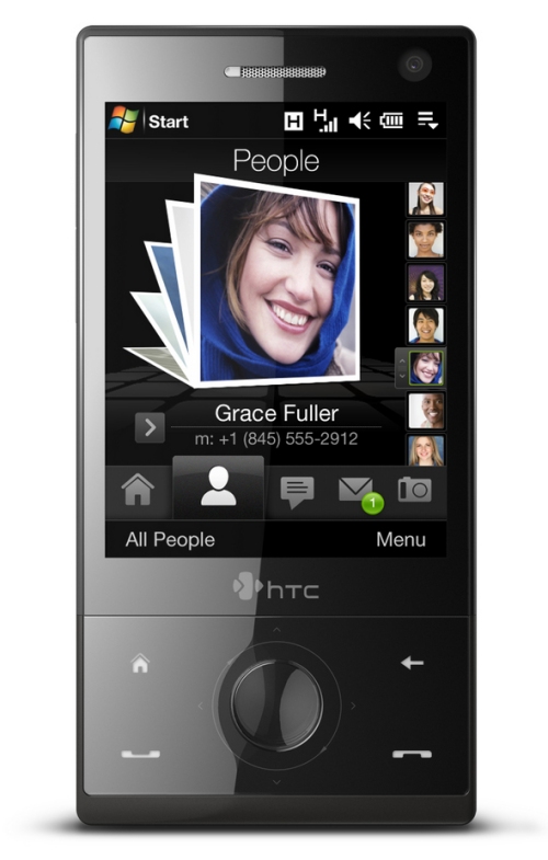
3rd screen shot which is bottom left.. is kind of similar to 2nd one.. but provides more things on the screen.. like speed dial, preview of msgs, emails, pictures, etc… but for all this I have to click on relevant tab.
4th screen.. just shows me programs, nothing else.
Now, as a information hungry… 4th UI fails for me completely, I do not get any information easily.. I need to click click click and get the information I need. Time consuming.
looking at 2nd and 3rd, I do get information, but not much.. only a little.. and for more information again click.
1st screen… provides me information that I need just at a glance.. I dont need to click anywhere.. no need to scroll.. a great UI for information.
User Interface design and interaction wise.. 2nd, 3rd and 4th are great.. but does not give me enough information.. in which 4th one fails like anything.. 1st wins..
so on my cell I disabled all HTC cube or HTC Touch plug-in and gone back to my normal Windows Today screen.
I will be more glad and it will be more useful, if companies design user interfaces keeping information in mind rather than making people wow about the how it looks and how it animates, etc...


1 comment:
I agree with you., Infact I have also disabled all the funky stuffs and using just original WM Desktop in my HTC.
Post a Comment